A design system is the collection of decisions, components, and documentation that allows multiple people to build consistent-looking products without having to reinvent decisions that have already been made. For small businesses, a design system means your website, your app, and your marketing materials share a visual language. For larger organisations, it means different teams can build independently without creating visual chaos.
The process starts by auditing what already exists. Most organisations with a design problem have dozens of slightly-different versions of the same button, six shades of the same blue, and typography that varies without logic. Before we build anything new, we understand what the existing inconsistencies are and why they emerged.
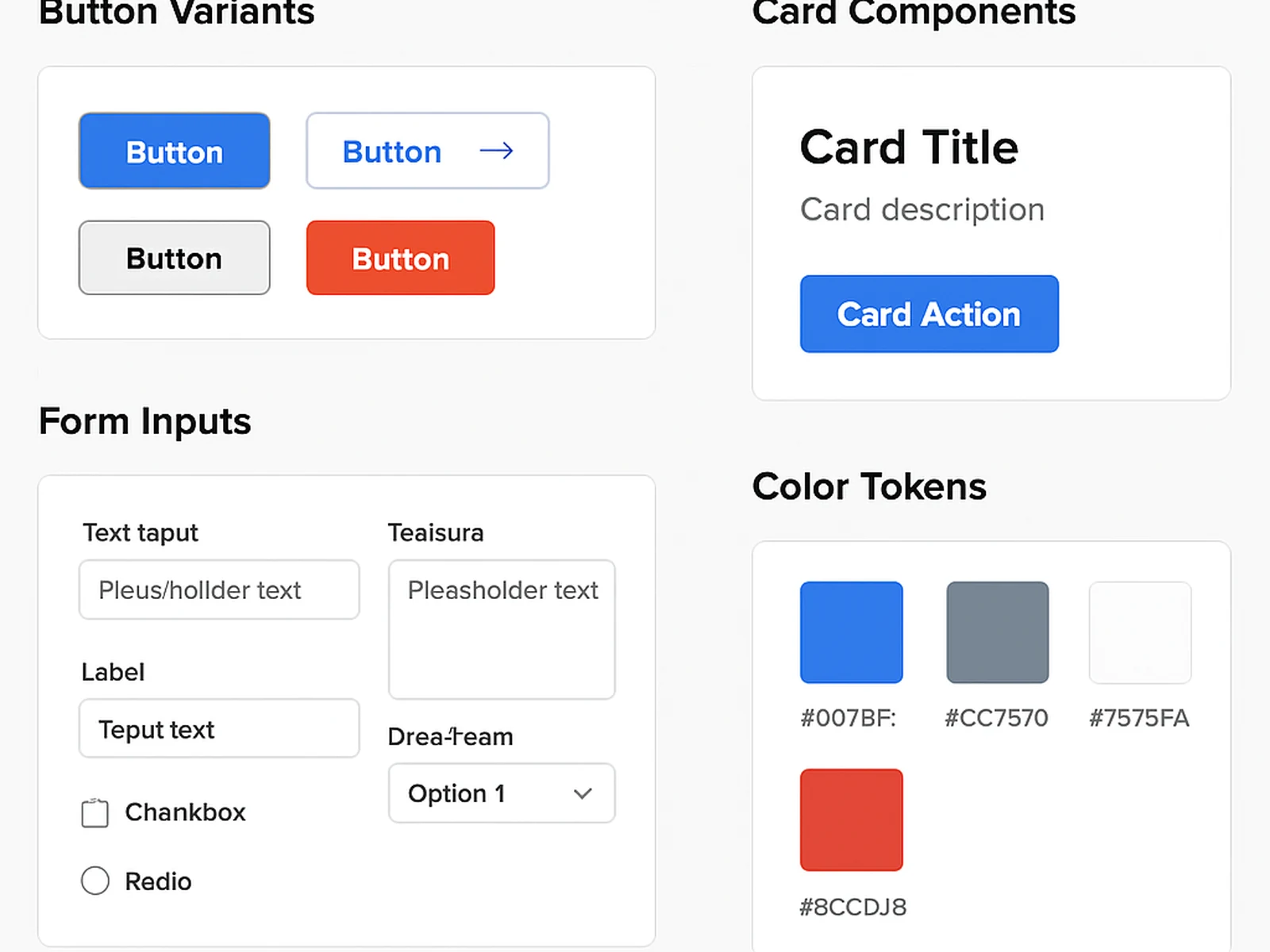
Design tokens
Tokens are named values that represent design decisions. Instead of a button that has the hex color #3D1A24, it has the token brand-primary. If brand-primary changes, every component that references it updates automatically. Tokens are the foundation of a scalable design system and the connection between design and development.
Component documentation
Components in isolation are not useful if people do not know when to use them or how they behave in different states. We document every component with usage guidelines, variants, states, and examples of correct and incorrect application. The documentation is written for the people who will actually maintain and extend the system.